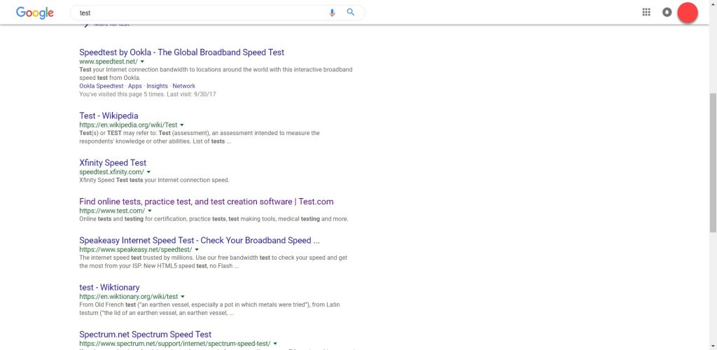
There has been chatter amongst SEO’s that Google has been quietly testing out a new design for the desktop SERPS. News of this potential change arose when a use took to Reddit to share screenshots of a slim lined Google search results page.
The original thread can be found here.
The new test design doesn’t consist of ground-breaking new design elements or a distinctly different layout, but with the rise of mobile searches and mobile specific algorithm changes it’s refreshing to see Google assign time to desktop which has see little refurbishment over the past few years.
The design wasn’t tested for long but a few speedy Reddit users managed to capture screenshots in time that show the main changes, which can be seen below.
As we said, these are hardly extravagant changes, but the minimal changes are noticeable. The main differences between the current desktop SERPS and the test SERPs are:
- The Google logo appears to be noticeably smaller in the test design, possibly to fit in with the other design elements
- The search bar is no longer static at the top of the page, they have adapted this to be a ‘sticky header’ which stays with you at the top of the page as you scroll so if you want to do another search you don’t have to scroll all the way back up the page. This may be a sign Google really is going to implement the one-page SERP i.e. no page 1, page 2 etc but an infinitely scrolling results page.
- The search bar also has rounded edges in contrast to the current rectangle shape
It is yet to be seen how many, if any, of these proposed changes will make it through to the final live design. We particularly like the sticky header and think this would be very useful for users but think the other changes i.e. logo size and rounded search bar are unnecessary changes.

